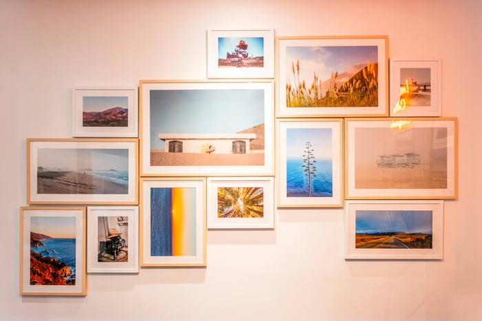
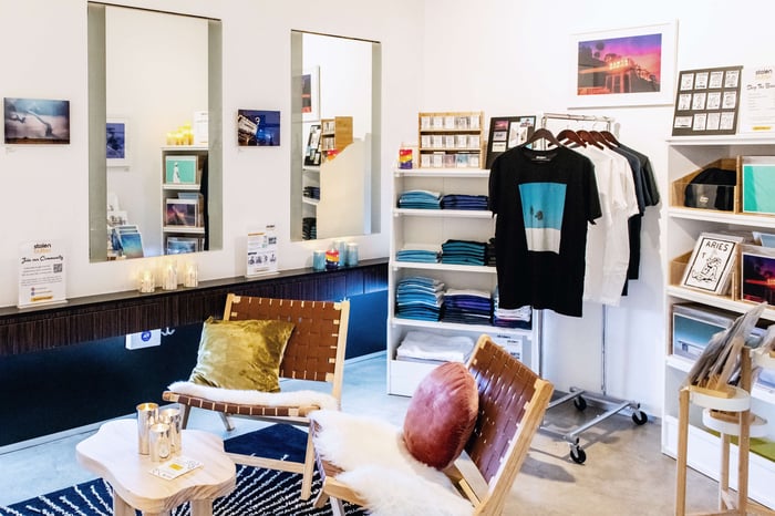
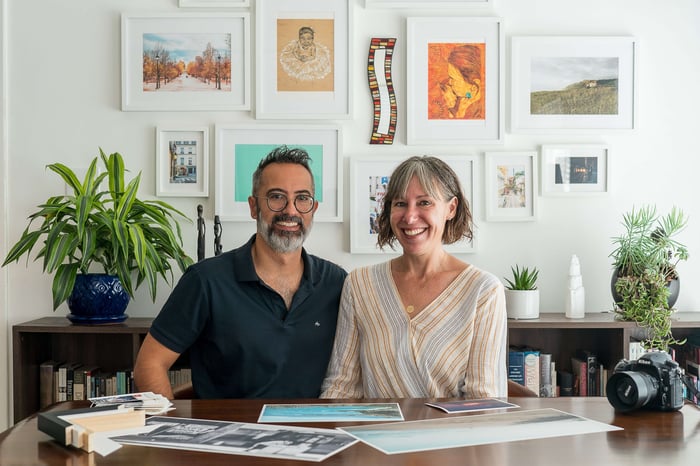
California is more than just sun-bleached roads winding through swaying pampas grass and endlessly blue skies that melt into dusk. It's the next wave, catching air off the lip of a concrete bowl, or a moment of stillness by a raging sea. It's a place of hope, optimism, and found family, where people from all walks of life come to pursue their passions with purpose and abandon.
The Golden State lives up to its name in so many ways that capturing the many facets of our beloved home in one collection seemed as improbable as California itself, but it's from a shared appreciation for this breathtaking, diverse, and ever-changing place that Love, California was born.
In this stunning visual love letter to California, photographers Denny Fanning, Alexander Lombardi and Rachael Thompson harness their inspiration to weave personal narratives out of the eternal landscapes and small moments that surround and inspire us every day.
When Luxelab offered them the opportunity to use the bustling salon as their canvas, they endeavored to be as creative as possible and built a colorful oasis amid its sleek black-and-white aesthetic. Bringing Love, California to life meant not only immersing viewers in the rich colors and textures of the West Coast, but providing a respite in an L-shaped room tucked in the back of the salon for stylists and clients to kick back and enjoy it.
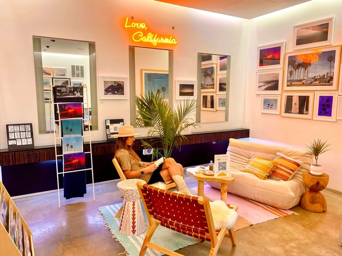 Luxelab stylistJulie Weiss reads a book in the Love, California art lounge.
"We wanted to create a warm and inviting space that felt like California," says artist and Stolen Butter founder Rachael Thompson. "If you have limited space, gallery walls are a great way to make the space more dynamic using multiple prints."
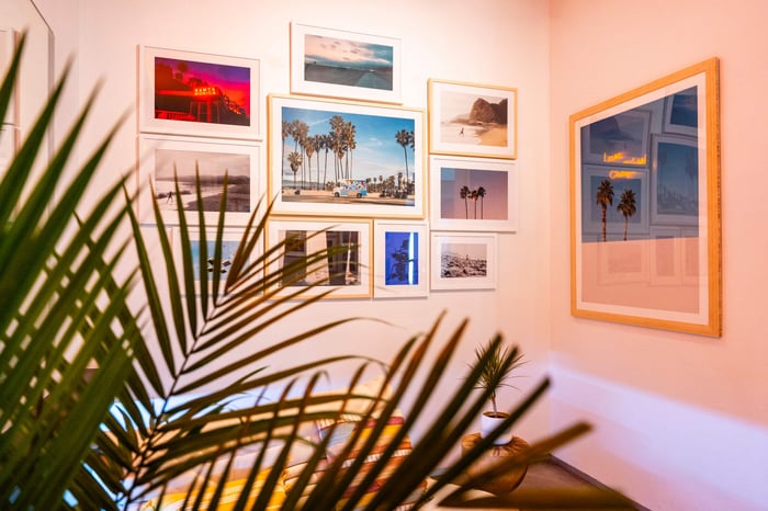
But displaying the 45 pieces that comprise Love, California in a small space was a bit like assembling a puzzle while blindfolded, so the team took inspiration from the work and designed gallery walls in the shapes of the sun, a brick wall and a 10-foot wide wave.
To do this, installation guru Victor Thompson first measured every stretch of wall in the salon to gauge exactly how much real estate they had to work with. He then drew a scale model on a piece of paper with rectangular cutouts representing each print size in the collection.

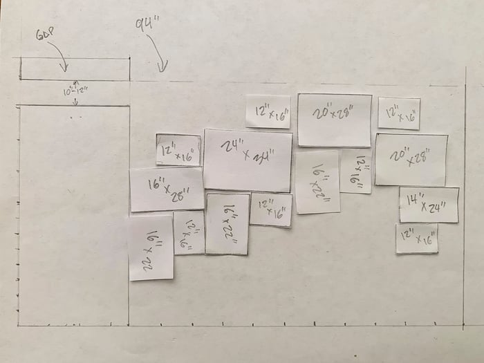
For about a week, they arranged and rearranged the little shapes, snapped pictures of the patterns, and experimented with different layouts to make the designs come alive.
"We wanted to make sure that the gallery wall design amplified the prints without crowding the walls," he said. "The frame colors complemented the prints, and we arranged large, medium and small print sizes in a way where their themes would flow into one another."
Installing the art required precision and knowing exactly where each piece would go before the first piece was hung. So Victor traced each frame on brown masking paper, cut out the rectangles and taped them to the walls a half-inch apart.
One by one, he marked the frame edges on the walls with pencil and measured to place the hooks at the right level before hanging each print. Once the art was installed, they turned their attention to the lounge.
To create a warm and inviting atmosphere, they moved out the salon furniture and appliances, and brought in a sofa, two low-slung chairs, a wooden cloud-shaped coffee table, a drum-shaped side table, and a pastel-colored Mexican blanket to tie the elements together.
Finally, the small details — a potted Majesty palm and other native plants, a bundle of sage, and some seashells — completed the beachside alcove.
"Our goal was to make an art lounge for visitors to rest, enjoy the artwork, and shop," says Thompson. "We wanted people to walk away feeling connected and inspired to this amazing place we call home."

